The announcement that the Chattanooga Police Dept and the Hamilton County Sheriff have started using CrimeReports.com is good news. If you haven't read the articles with info from the press release then read them first for some context - Chattarati and TFP reported it. This provides a great tool for citizens and Neighborhood Associations to see what incidents are happening around them and to be able to do some basic analysis when paired with other tools. So, I will use the CrimeReports site as a point of departure to explore a handful of these online tools available to us in Chattanooga and Hamilton County. These tools, combined with neighborly communication, should help people understand more about the public safety issues surrounding them. So, for the first installment, lets look at how to use CrimeReports.
CrimeReports provides departments with a way to share their incident reports with citizens through an easy to use map interface. It appears to be a Flash wrapper around a Google Map rendered through the Google Maps API from the incident file.
To use the site, simply type in a location in the My address field and click Search. (You can just put in Chattanooga if you don't wont your address added to their database.) In addition to crime incidents, it also provides detailed information on registered sex offenders, including their address and for many a photograph and physical description. Careful with that data, there is a disclaimer you have to agree to when using it. If you are just looking for crime incidents, you can toggle the sex offender layer off. (This data layer seems to come from an API call to the state registry.)
Now that you have defined the area you want to look at, you just have to pick the time frame you want to see and the crime types from the Map Tools bar in the upper right of the screen. You have a choice of 3,7,14 and 30 days for the quick links, or a custom time frame from the calendar. CrimeReports is going to show you a moving window of 6 months, so if you think you will want to see data from June 10th sometime in the future, you would want to capture that data today. The Crime Types pop up allows you to select up to 30 incident classifications. Once selected and applied, you get a map showing those incidents in the time frame chosen.
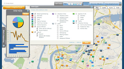
Exploring your map is fairly intuitive, you click on an incident icon and get a pop up that gives you the date, block location, police report number(?), time, UCR classification, and reporting agency. You can also email the incident to a friend from the pop up. One of the best features is the Crime Details toolbar on the left side of the screen. From there you can get a list of incidents by crime, date, and distance. Click on the Trends button and you get can get your graph on. Click on a graph to enlarge it. Click back on the Details button and look at the bottom of the window, you can print a list of all incidents in your filter. Very nice. Unfortunately, it isn't easy to copy and paste that info out because it is a Flash pop up. I even printed it to pdf and couldn't extract it because it is an image, oh well.
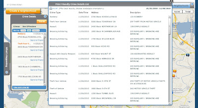
There is also a neighborhood feature pending, click on Create a Neighborhood to see the status message. This could be an interesting feature, but I can see how it would be impossible to control.
Nice tool, easy to use, and now that you know how it works, you should get the free CrimeReports iPhone app! It is a very nice app that can, of course, use your current location and show incidents reported near your location. If you create an account with the site, you can even setup alerts for reports. Of course, these alerts will only fire when the file containing the incident is uploaded, so the alert could be 3 days old when you get it, but it is still a very nice feature.
So now you have looked at all the incidents reported around you and seen trends over 6 months... now what?
If you are interested in the trends for these crimes in an area, you can always hit up the SOCRR Public safety report from the Ochs Center. For incident counts and trends over 5 years, choose a neighborhood and play with the Tableau Public interface, I also posted one a while back.
If you are interested in gaining insight into a particular incident or series of incidents, then you need some more tools to use along with the map. I will outline some of these in upcoming posts. A hint to what is next... you noticed that the data CrimeReports gives you only provides a block location and not an address of the incident. Well, and I may be making some assumptions here, the Google Maps API isn't going to map with any level of acceptable accuracy a block location. It needs something like an address. If you zoomed in on any incidents, they are sitting on top of a parcel. Oh yeah...
Friday, December 10, 2010
Friday, November 19, 2010
Catch Up
Ok, been a while... and a lot has happened.
On the Ochs Center's SOCCR front, the Health report has been released and the Economic one is soon to follow.
Tableau Software released version 6 with some nice new features.
I have started playing around with Google Refine. It is a Google release of a previous Freebase app used for cleaning up messy data. To give it a try, I have been using it to clean and prep the NUFORC database that I got from InfoChimps. It is a really nice tool. It works very well for things that would take function writing in Excel or cursors in mySql. It certainly doesn't replace those two, but works very well with and between them.
Oh yes, UFO data. This is the most distracting data I have ever worked with because I want to read every entry. There are over 60,000 entries in the set, I extracted the 870+ ones for Tennessee and further broke it down to the Chattanooga area. I hope to have time to work on extracting the ones for the US, but it is a little messy....that's where Refine is helping. Here is a preview of some info. This graphs the reported shapes, or lack thereof, of the craft. (Note: this is TN only).
Friday, September 3, 2010
2010 SOCRR Public Safety
In case you missed it, the Ochs Center for Metropolitan Studies released the public safety part of its 2010 State of the Chattanooga Region Report (SOCRR) a few weeks ago. You can, and should, download the full report. However, there is a very nice new feature on the site that uses Tableau to display, and allow interaction with, the report data.(North Chattanooga example) Below is a version of it with side by side viewing of crime rate changes by percent and number of incidents. This one works ok to about 3 or 4 comparisons, but with all of the years of incident totals you have to scroll a bit. I did this to demonstrate the fact that you, yes you, can download this data and do something with it. Two things about this - Why this is important and how you can use it.
Is Important - Having these interactive worksheets on the Ochs Center's site is important for many reasons. The ability to interact and do comparisons between neighborhoods is done in an intuitive way that simply wasn't possible before. This tool is great for individuals, organizations, and neighborhood associations who, in the past, had to dig through the full SOCRR or compare individual pdf files for the neighborhoods. Now you just click to build the info you want to see, maybe do some tweaks and then you can save an image or pdf of the chart to use in a presentation. Better yet, you can view the data and download it. If you really need to spend some time with it, download the whole workbook and explore it, full screen, on your computer with the free Tableau Reader. (When using the site, pay attention to the icons on the bottom of the viz, they are what allow you do these things.) This tool, together with the full SOCRR, is a strong combination. The tool allows for quick reference and numbers, but without understanding the data sources and report methodology outlined in the full report, it is just looking at the surface.
Use It -
Apart from doing quick comparisons here or at the source, there are more fun and powerful things you can do with it. As mentioned, you can download the whole workbook from the download link in the lower corner of the viz. This workbook can be opened in any Tableau product and explored or, in Desktop and Public, manipulated and transformed. For example, if you just want to explore the charts full screen, you can use Tableau Reader. It gives you basic functionality but doesn't allow any changes to the data or workbook. If you wanted to dig deeper and alter it to your needs, you could use Tableau Desktop or Tableau Public(free). (Note - anything saved in the Public version is published to Tableau's servers and is available to be downloaded by anyone. Thats how you got it!) With the one below, I took the workbook, cut it down to a few sheets and created a dashboard and placed them side by side. Another one I am working on triggers the charts from the shooting map I built. So you click on an incident and it displays crime stats for that neighborhood. Likewise, I will try to set a filter on the neighborhood list so choosing a neighborhood will highlight the incidents on the map. You get the idea. Keep an eye out as the rest of the SOCRR is rolled out.
(Another note: Not that it would change things here, but I am now on the board at the Ochs Center. I don't have any connection to Tableau, I just love and use their products.)
Wednesday, August 18, 2010
Transparency and Scrutiny
Something I have been thinking a lot about this year is the role of support and scrutiny in respect to transparency. I would guess that in many places resistance to a broader transparency in government is rooted in an aversion to, or fear of, scrutiny. On the opposite end, we would have proponents of transparency with an interest in using the open data and information to support their cause or interest. What is the difference? If my cause is to scrutinize a particular public figure, then I seek information and data to support that. Or if I am supporting a particular candidate, I would be interested in information that would support them and their claims. Etc. Etc. I think the two intentions, support and scrutiny, are, in the case of civic participation, inseparable parts of a whole. For now, I think the tone of this interplay is set by the initial intention. If one sets out to "hold feet to fire", then they will be on a mission to scrutinize. Perhaps the counterpart to this, as support, would be "keeping one's head in the light".
This relationship will continue to be in my thoughts as I hope it reaches a point of maturity. However, in light of the past few weeks in Chattanooga, I thought it was apropos to discuss with a recent transparency discussion at the County Commission and an active effort to recall the mayor and some council members.
Contentious times in the Scenic City. Not yet time to quote Schiller, but Lincoln out of context....
"I am loath to close. We are not enemies, but friends. We must not be enemies. Though passion may have strained it must not break our bonds of affection. The mystic chords of memory, stretching from every battlefield and patriot grave to every living heart and hearthstone all over this broad land, will yet swell the chorus of the Union, when again touched, as surely they will be, by the better angels of our nature."
Thursday, July 1, 2010
Shootings by Day/Council District
This graphic is one of several that are taking shape from the shooting data. I am taking the different descriptive dimensions in the dataset and combining them to see what is there. Other dimensions include school zone, school district, neighborhood (defined using the neighborhood map from the Ochs Center), and day and time of incident. While a lot of these pieces aren't a surprise, it is interesting to look at them in new ways. For instance, I would not have guessed that, for this year, Tuesdays would be a big day for shootings second to Saturday (11 and 13 respectively). In District 8, Tuesday beats Saturday 7 to 2. Below are the District 8 incidents on the map coded by day.
Thursday, June 24, 2010
Wednesday, May 26, 2010
A few weeks back, the Twitter Census datasets were released by Infochimps. There are several datasets in the collection that is comprised of a scrape of Twitter's 40 million users..
I downloaded the Twitter Users by Location dataset to explore. I first unzipped the file, added a .csv file extension to it and opened it in Excel to see what the data looked like. Basically a long column of entries from the location field on the Twitter users's profile. There are 3.6 million rows in this dataset, so Excel wasn't quite capable of doing the work. I switched to a terminal screen and used cat to look around. While letting cat stream the data up the screen, I saw two large blocks of clean coordinates. One block were users who used their iPhone to put coordinates in the location field in Twitter, the other block must have been another phone type(BB?) doing the same as they both had consistent characters prefixing the geocoding. I used the prefix to match and extract those lines into a separate file, loaded them into a mysql table, ran some delete commands to remove invalid coordinates, and ended up with over 500,000 points to map. You know the rest, I connected to the db with Tableau and watched the map render. Some of the maps are in a Picasa Album along with some more abstract images from the map.
To do these, I just set the map layer washout to 100% and started zooming in to different areas. The image above is Atlanta, Ga. I liked what I saw but wanted to add more color to them. The database this is pulling from is just a table with 3 columns- a unique id, latitude and longitude, so there was nothing there to use as a dimension to apply color to. So, I created some new columns and used the rand() function to populate the first column with random numbers between 1 and 5, and the next column 1-10. These random numbers were then used as the color in Tableau. Below are a couple of results - the first is the eastern US with 5 colors and no other changes, the second one is Atlanta with 10 colors, open circles for the markers and transparency increased. More of these are in the Picasa album and more will be put there.
Again, these images represent a set of 500,000 locations extracted from a larger set of 3.6 million. I think for mapping purposes, the remaining 3 million would just show more of the same, but would certainly fill in some blanks. (For instance, no coordinates were in there for North Korea, but a text search revealed a couple of dozen hits for North Korea.) However, for the abstract images, I think more would be better. I am working on a few simple searches and then some regular expressions to sift through the rest and pull out things that can be mapped. These include addresses and other coordinate sets. The big challenge will be trying to map the ones that just have a city name, for instance Atlanta has around 10,ooo points now from coordinates, but a search for Atlanta reveals at least 10,000 more by name. My plan is to take those returns and use the rand() function, or something else, to randomly generate coordinates within the area of interest and see what happens. Hopefully a purely aesthetic cartography.
Monday, May 17, 2010
Poetry Concat()
In the last post, I talked about reshaping the Stand categories to change it from wide to long data. The next thing I did was to concatenate, or reassemble, the responses. The four questions were divided into up to five sections for categorization. In order to easily browse the responses, I put them back together. I used Excel to simply merge the columns and loaded the resulting file in to mysql. To keep the sections neatly separated, I could have inserted a column between them with a special character or string that would mark the change or be replaced by a space or some other delimiter. I didn't. The result is much more interesting as evidenced from a few selections below. The csv file of the concatenated responses can be downloaded and combined with the one for the categories. Two more tables and you will have the basic database I use for ad hoc queries. Woo-hoo!
On to the poetry concat()....
see above healthier population see #2
walkable downtown mountains
outdoors affordable
downtown weather
future potential lifestyle values
see above no rich tards running it no snow see #2
aquarium fiber optic lines
downtown river bridges boats grass
see #1 plus direct air flight to NOLA see #2
drugs that would take care of crime
recycle not litter carpool
visitor - not sure
clean more well restored buildings
see above see #2
clean drug and gang free
i just did
? plant stuff
historic clean safe religious
traffic traffic traffic traffic traffic
education taxes litter pollution
crime education apathy
see above see #2
Ok, that is just a few combinations of words that I liked and found in a few minutes of scanning the first few hundred responses, found a theme, ran some queries and went with it. Many many more and better ones are in there. More gems to come.
Note: If the main download link doesn't work, try the one just above it to the left.
Monday, May 10, 2010
Stand cat reshape
The first thing I did when I downloaded the Stand results was to load the csv file into Tableau. It was able to do some nice basic mapping, but when it came to graphing and mapping categories it wasn't happy. The categories are assigned to the responses in pieces.( A brief data dictionary might be in order.) To the best of my knowledge, the 4 Stand questions were broken into 5 possible responses each. This was derived from the fact that the paper survey, which most of the results came in on, had 5 lines under each question. So some people filled it out as bullet points, 1-2-3-4-5, while others used the lines for a narrative response. Either way, each question was broken into 5 parts and each part could receive 3 category designations. Four questions, 5 parts, 3 categories gives us the potential of having 60 category designations per question/respondent. This is wide data. Many columns per row. Whether due to the way Tableau works or my ignorance of it, I couldn't get the wide data to work when trying to do category analysis per response record or per category designation. I needed to take the wide data and make it long data, or one row per respondent per category number. Excel was the savior in this. I downloaded an extension for Excel that did just that and reshaped the data to create one row for each designation. Five minutes later I had a spreadsheet with case numbers and categories that their responses fit into. Luckily, not all of the responses were 5 lines with 3 categories, otherwise it would have gone beyond Excel's limits. It turned out 273,000+ rows. I used this sheet for one of my four final database tables for looking at Stand data. I will outline and share the others in upcoming posts. While I do have 2 primary dbs of Stand data, I mostly use the Stand web interface for quick queries and preliminary scanning.
Note: My intention was to put up an interactive visual Stand exploration tool on this blog. It might still happen as I imagined, however the free Tableau Public tool has a row limit which the category sheet above more than surpasses. I hope to still create a map interface that then displays results from the web interface via its API.
Wednesday, May 5, 2010
2010 Shooting Map Update
This map updates the previous one, so covers and additional 3 weeks. I will post the same data by zip code later. If interested, you can then look at Stand results under the Crime subcategories and see how it meshes with these maps. An example is the subcategory for Violence.
Friday, April 30, 2010
Its Arbor Day somewhere.
I have been, slowly, working on placing 3D trees that are in the city's urban forest/Take Root project in Google SketchUp for eventual inclusion in Google Earth. This is part of the Chattanooga 3D project. While there are scripts that can be used to mass import objects to SketchUp, I have been placing them, some 1700 trees, by hand. The initial placement on the block tiles moves pretty quickly, but some of the placement points are on top of cars, in the middle of the street, or on a building - so some fine tuning is required. The KMZ file that I am using can be downloaded for your browsing pleasure. (I finally setup a Google Doc share to hold the files and datasets that I keep saying I am going to post.) Once you download the file, just open it in Google Earth. Another piece I have been working on is a file that has the species list as well. This is where it can get fun. I was recently in San Francisco and New York, both cities are releasing data to the public, and both cities have tree loving developers that built tree apps, SF Trees and TreesNY(Near You) respectively. Both functionally and aesthetically, I prefer TreesNY, but I had much more time to play with it than I did SF Trees.
Now, to real trees. I hear that VW has been planting a lot of trees around town. Hopefully all of those are being documented by plant date, geocode, and species and that they will get added to the map. If you don't get rained out, show some arboreal love this weekend. I have some small trees that I am going to try to get in the ground with the kids. If you can't plant a real tree, I would bet volunteer virtual tree planters would be welcomed to the Chattanooga 3D project!
Oh, and here are the Chattanooga Stand results for the tree category. Go and explore.
Monday, April 26, 2010
Back in CHA
Nice to be back in Chattanooga after being gone for 2 weeks! Came back in time to do Day of Service in East Chattanooga on Saturday and to get strawberries at Chattanooga Market. My trip started off in San Francisco for higher ed tech conference. Luckily there was time for food and some opengov. Open Gov West had a follow up meeting to their conference in Seattle while I was there. It was an incredible group of people from the bay area, Seattle, Canada...oh, and Tennessee. Some of the attendees were from the city and county of San Francisco and are behind DataSF, other groups represented included Code for America, and Knowledge as Power. Big ideas and wonderful conversations that I was honored to be a part of.
Next up was 5 days without wireless and almost without cell signal in and around Stillwater, NY. After that, I rode with some friends down to NYC. On the way we dropped one person off at Gate Hill Co-Op. Her house is feet from the old farm house where John Cage, David Tudor, and 7 others lived in the early to mid 50s. (Cage later built a house up the hill. ) Then on to the city. I rented a bike and rode from midtown up to the Cloisters. Almost everyday, I put the Trees Near You app to work identifying trees.
In my downtime in two of the best open data cities, I took time to work on some ChattaData too. I took the csv of the Stand data and reshaped it to use for category browsing in Tableau. I also broke it up and put it in a simple mysql database to run ad hoc queries against. I will post both sometime soon once I get back into the swing of things.
Tuesday, April 13, 2010
The Value of Data, Pt. 1
"The cynic knows the price of everything and the value of nothing." - Oscar Wilde
For the most part, data has a price. Whether it is a survey crew using GPS to gather geographic information or a Stand survey crew with clipboards to collect responses, data has a price. It costs money to prepare to gather it, to gather it, to process it, to analyze it, to report on it and finally to present it. The price tag is always there. I have to admit, there have been several times where I have questioned the price of a dataset. One in particular was one of the food economy reports that the Ochs Center produced. In the moment, I only looked at the price and wondered why we wouldn't just use that money to *do something*. Now, I have no doubt that things like the Benwood Foundation's Gaining Ground project/initiative might not exist had the Ochs Center not done those studies and reports. At the time, I was unable to see the value in the work.
Value is something latent in data. It is not until people use the data to *do something* that value starts to emerge. The exciting thing, for some datasets, is that we have no idea what great ideas people are going to come up with to put them to use. Governments can open data, but it takes developers, organizations, and individuals to transform a dataset into something valuable. Something informative. Something formative.
Monday, April 12, 2010
Chattanooga Stand
Above is a map showing results by zip code in the Chattanooga MSA. There are dots all over the US as well, but that image doesn't translate well....and honestly this map, in its static form doesn't either. The bar chart below does a better job. It is filtered to show only zip codes with 300 or more responses. I chose 300 as the cut off in order to make the image manageable and readable. While I didn't double check it, I am pretty sure most of the ones in the chart are in the MSA as well.
Stay tuned for more Stand data and info as the exploration continues. There are certainly a lot of great individual responses. I will use the ChattaData Twitter feed for one-off observations and post for more substantial ones. Feel free to share any thoughts and/or observations here as well. Go explore!!
Thursday, April 8, 2010
2010 Chattanooga Shootings
I have been working with some people for a while on mapping the sites of the shootings happening in town. There is still a lot of work to do on the data driving the map, but with this being a big part of the conversation going on in the city, I wanted to go ahead and post the map in progress. In this static form it tells us three things. Shooting locations/approximate locations marked by dots, orange dots represent shootings resulting in injury, red resulting in death. The size of the dots corresponds to the number of incidents at that location. (This view focuses on the heart of the city and, therefore, does not include the Sanders Rd. incident.) Once the data is fine tuned and triple checked, there will be an interactive version of this map. As this is a work in progress, please let me know if you see any obvious errors on the map.
Reminder: This map represents three facts and does not represent any crime analysis or interpretation. Oh, and you should click it open to another tab to see if you haven't already.
Monday, April 5, 2010
Pointless and Bible Black
The other day I was looking at a map of Chattanooga that was color scaled to show the percentage of the population that met, or fell short of, some criteria or other. The polygons were, I believe, Census tracts. The color scale went as follows: yellow, green, dark green, blue, black. This is from lowest to highest percentage. The frustrating thing was, of course, that the details for the tracts in black were pretty much illegible. Decisions on cartographic color schemes can be tricky, luckily, there's an app for that....Color Brewer. I think the most important thing I learned from the site was making the color choice based on the function of the colors on the map, whether they represent sequential, diverging, or qualitative data. This might seem obvious, but many maps produced by professional GIS folks fall short. Color Brewer has become an indispensable tool in the Chattadata toolbox. Whether it is making ArcGIS default colors pretty or choosing a palette to use with R, Color Brewer delivers. (For some reason, I find myself using the first version of it more. You should look at both.) I used it tonight on a map, that will show up here once it is all growed up, and it made all the difference.
Wednesday, March 24, 2010
Census-CSV-Excel
If you haven't looked at our Census progress yet, they are posting new files daily at the Take 10 Map site. As of this moment the Mail Participation Rate for Tennessee is 54%, Hamilton County 54%, and Chattanooga 51%. I have been downloading the daily files on these, and recently they added the filter where you can download by state. I took the CSV label literally and tried to open it directly into Tableau as a comma separated value file. It wasn't happy since it is actually a pipe delimited file. A trivial thing to fix, but a good reminder of the fact that I haven't come across much data that was ready to go. In that respect, Excel is one of my new best friends. I have used it for years for pretty basic things, but as I have been populating some mysql databases lately it has been a workhorse. I use some other spreadsheet programs as well, but have several actions in Excel that make it indispensable.
So there. I have purchased a pc laptop and sung praise to Excel, all in one week, all in one post.
Sunday, March 21, 2010
Le Sacre du Printemps
My first paying 'job' was volunteering for the National Park Service for the hawk watch at Signal Point. The job was simple. I had to help spot, identify,count and record migrating birds of prey. Doing this meant that I spent my weekends in spring and fall with the Chattanooga birding crowd. When it comes to citizen data collection, you will be hard pressed to find a group more dedicated than the birders. Open Data? Crowdsourcing? These folks have been doing it for a long time. Below are two examples with data from point counts* and a volunteer effort to save a huge dataset.
You can go straight to the USGS Point Count Database to look at some numbers or start at the Migratory Bird Data Center which has other data and background info. The North American Bird Phenology Program is well worth looking at as well. In short, they house an historic collection of bird migration data collected on observation cards. Six Million of them. They are working with a small army of volunteers to scan and enter them all into a database so that they can be analyzed. (There was an article on Wired about the project last year that does a good job of explaining the importance of this data.) Having all of these migration records available will deepen our understanding cycles of bird populations. Mashing this data with other sets on development, climate and environment will tell us a lot about the impact that habitat loss has on specific species of migratory birds.
* A point count is basically what it sounds like. A specific point is chosen and marked, often by nailing a small coin sized marker to a tree. The birder counting that route visits it at regular times and records all bird seen and heard, mostly the latter.
** Original photo credit: R. Bruce Wilkey - 1980 - yes, that is me and yes that jacket is awesome.... have to see if I still have it.
Tuesday, March 9, 2010
TBL at TED 2010
Tim Berners-Lee at this year's TED conference discussing The Year Open Data Went Worldwide. Excellent follow up to his talk last year with some incredible visualizations of Open Street Map edits around the world with a focus on post-quake Haiti.
Monday, March 8, 2010
Pie eating contest
I went to a community meeting to hear someone attempt to persuade the other attendants to agree with them on some thing or other. The Persuader got points instantly for having handouts of the charts and graphs used in the presentation. Oh, and they brought enough so everyone could see. I arrived a few minutes late, so everyone was on the second or third pie chart. I thought I had missed The Pitch and was only going to get the chart parade. Next pie chart, and the next, every time I am having to call in a whiskey tango foxtrot to the first page to see if the quantities represented as proportions on the charts were the ones in the table on page one. Nope. Then, I felt a subtle wave go across the room and seize someone who blurted out, "What is your point!?". Civility broke down at that point and took a while to restore itself. Sort of.
I was a witness to a chart fail.
Lessons learned from a data presentation standpoint.
1. If presenting a table of numbers accompanied by a bar chart of the exact same thing, just do the chart.
2. When trying to illustrate percentages of something compared to the percentages of several other things, don't use a series of pie charts (on different pages and of greatly varying sizes). Use another simple bar chart or better yet, a segmented bar chart.
3. Don't show percentage without reference to the totals. Please.
4. Finally, don't mention in the presentation that there is another set of data that conflicts with the one you are presenting and not have it available for comparison as well.
This is just a summary of the chart fail that occurred for The Persuader. Eight pages of information without context or source reference, and seven of those were pie charts without totals represented. After what seemed like 10 minutes, The Persuader lost the room because the point was not being communicated and the pie charts only agitated everyone.
What I love about this experience is that it showed data at work, albeit poorly, at the community level. This is nothing new, not at all, but the presentation of data can always be better. The Persuader went to a source, gathered data, charted it and brought handouts for a meeting that could have been 10 or 100 people. So when I wonder what Open Data/Open Gov means to us as individuals and communities, this is one example.
Chart Note: You too can add serious or sarcastic charts to your site with the Google Chart Tools API.
Sunday, March 7, 2010
Never go full fish-eye.
Here is a fish-eye map of troop positions in Chattanooga in 1863. I find it to be a strange presentation of information. Perhaps I am just old fashioned in liking my troop position maps to be aerial views, even a bird's-eye view, but I never considered the fish-eye view. When looking at it as a whole, several trees are the dominant objects. Lookout Mountain is placed at 8 o'clock, so the fish's perspective was one from Missionary Ridge. Why this map adheres to the standard alignment of the cardinal directions, I have no idea. It seems that if you are getting this fanciful, might as well put North somewhere near 3 - 4 o'clock to place Lookout Mountain and Chattanooga as prominent features to those reading the map with human eyes.
All fun aside, it is an interesting graphic. I am not sure if it was a particular style of the time used for eye candy in publications, but expect so. You can get a high quality image of it from the Library of Congress' American Memory site to zoom in and explore. If you haven't spent time on the site, you should. Plenty of maps and photos of Chattanooga and the region. High quality (as in 160Mb) TIFFs are available of the photographs in the collection as well as the high quality map files.
Sunday, February 28, 2010
You eat where you are.
I have spent the last few days playing with Tableau Public and will certainly continue. I downloaded the spreadsheet, mentioned in the last post, of the Food Environment Atlas data and used it as my source. The map is filtered to the tri-state area and the smallest level of detail is county. The graph is just what it looks like, states and their totals.
For this visualization I chose the data representing population that is classified as low income (from 2000 Census) who live greater than 1-mile from a grocery store (2006 data). Take a few minutes to explore the map and graph. You can manipulate the filters and mouse over dots for data. These were done fairly quickly to explore the Tableau Public interface and publishing features. You can certainly learn some things from this visualization, but it is just a different way of exploring one piece of the Food Environment Atlas' data.
To get a better understanding of the importance of place and food access specific to the Chattanooga area, read the Ochs Center's report on Food Access and Price from last December. These types of indicators contribute to getting an overall picture of a community's health and is apropos to today's Chattanooga Times Free Press which features a map on the front page for their Heavyweight States piece focusing on the tri state area's adult obesity percentages. Take a look at it and compare it with other indicators on the Atlas.
NOTE: The Tableau Public tool is only a few weeks old and might not work with some versions of Safari. I have tested it in Chrome, Firefox, and IE and it seems ok.
Tuesday, February 23, 2010
Exploring local food data
With the Georgia Organics conference happening last weekend in Athens and the winners of the Benwood Foundation's Food System Ideas Contest being announced soon, ChattaData has local food on its mind.
Go look at the local food data in the Food Atlas to get a sense of where we are "now". The graphic above is a heat map showing the number of farmers markets, with us having 1-5. (Color selection is a little off with a light cream color next to the grey, oh well.) The sources for this data can be found on the Documentation page. It shows that most of the local food data is from the 2007 Ag Census County data, some from the Census Bureau's Population Estimates, and 2009 Farm to School data compiled by the National Farm to School Network. (More info on their sources is mentioned on the page as well.)
Being someone who has been involved in the local food conversation for a while now, I feel that we have come along way since the 2007 Ag Census. So it will be interesting to see if our color, in the map above, gets a shade darker in the next Ag Census in 2012. I hope so.
Soon, we will take a look at other parts of the Food Atlas, It is a nice, easy tool to use. You can, of course, download a spreadsheet of the dataset for yourself and look at it that way or do something fun with it.
Friday, February 19, 2010
Thoughts on Open Data
What does Open Data mean to you? Do you see yourself gaining value from it? Have you used Data.gov to retrieve any datasets or used any of its tools?
Wednesday, February 17, 2010
4 idiots of unknown nativity
You too can spend time digging in old census data! This tidbit is from the 1850 census, and the figure is for the whole state, not just Hamilton County. Looks like most of our idiots were homegrown white males. While it is not surprising that such a classification existed 160 years ago, it is fascinating to dwell on, and is a good example of, the subjectivity of data collection and classification. Some census worker(s) in 1850 - Tennessee, matter-of-factly classified these folks as idiotic, a class stated in the directions of the census and one understood in the culture of the day, but were unable to gather where they were from.
(Sidetrack - Idiotic classification/quantification continued for a while, but I haven't looked up the numbers on them. Also, having a family and a job, I must limit my time spent parsing historic figures of idiocy. Perhaps I should be more concerned with the lack of quantification of idiocy in the 2000 census and its certain absence in the 2010 census.)
More census fun and facts to follow. Census.gov is an incredible resource. I find myself going there more and more. Whether it is for historic data, population projections, or shapefiles for GIS use. Spending some time on the site will give you an appreciation of the wealth and value of the information collected, and hopefully influence your decision to be a part of the 2010 census.
This all contributes to what will probably be a continuing topic on ChattaData - the dual role we have as data consumers and generators.
Tuesday, February 16, 2010
Welcome to ChattaData
ChattaData consists of a Twitter feed and this blog. ChattaData on Twitter will feature data and information about the Chattanooga area. Its people, places, history, events, and any other items of interest. The blog will expand on some of these numbers, but will also reflect my exploration of data and information and how it continues to change our lives. Additionally, public data sources will be discussed as well as data graphing and visualization tools. There are many good resources for these tools out there, but here they will be used to reflect on local and regional data.
These numbers will give us insight into where we are and who we are. Additionally, the sources of these numbers may reveal a regional metadata. That is, information about our available sources of data and information.
In doing all of this, we inevitably learn things about Chattanooga, but this cannot be done without also placing us in the bigger contexts in which Chattanooga lives. Hamilton County, Chattanooga MSA, TN, USA, Spaceship Earth.
Subscribe to:
Posts (Atom)