Friday, April 1, 2011

Spending cuts to turn lights off?

I don't get it.

After watching this video during Sunshine week, the value of E-Gov spending should be obvious. Yet, HR1 cuts funding to these projects to the point where the IT Dashboard, Data.gov, paymentaccuracy.gov, USAspending.gov, and Apps.gov all face shutdown in the next few months. If you haven't ever looked at or used any of these sites, or didn't know they existed, take a few minutes and check them out. Do they seem to be valuable tools for informing citizens of government activity and spending?

So what do we do? Some folks, including Tim Berners-Lee, have encouraged people to sign petitions like this one from Sunlight Foundation. Others remind us that the dotcom bust gave way to Web 2.0, so maybe this would give rise to something better on the post Gov 2.0 side of things. However, I think the biggest casualty of this is, and will be, the lack of our elected officials placing value on open government. Having buy in for transparency and open gov from government workers and officials is key to the success of opening data at any level of government. If the benefits of doing this are not valued by those we elect and employ, then we should not expect much transparency. If these federal government sites fall, then we no longer have them to reference, not just for the value they provide, but as an example of open government in action.

So when I read statements from our congressional reps about reducing spending, cutting government waste, and keeping government on the straight and narrow, I don't think that discarding tools that allow us to monitor (some of) their efforts is a good idea.

Thursday, March 10, 2011

Crime and Confusion

There are two shooting related stories in today's news, the first a homicide the second this weekend's gang summit. I don't have all of the shooting data from last year at hand, see previous post, but have it backed up somewhere. From what I can tell, we are about where we were last year but one less shooting and one more homicide. As of 3/10/2010 - shootings = 12 and of those, 3 were homicides. As of today we are at 11 and 4..I think. I went to check the shooting list and map that the TFP has on their Right2Know page, but as of today, it is exactly one month out of date, and the last shooting it has listed was upgraded to a homicide.(The bookings, which account for more screen real estate are, however, up to date:) Hopefully they will get that updated soon. I checked CrimeReports.com to see what it had on the homicides, nothing. (Granted one just happened last night.) This might just have to do with how the incidents are upgraded and how those upgrades do or don't get sent in the file to CR.com.

It is a bit confusing trying to catch up on this type of thing if you haven't been gathering it along the way. Even though there is a lot of room for improvement, we have come a long way in the last 6 to 12 months. This time last year, there was no CrimeReports map, no Right2Know, no regular Tweets from CPD, no Chattarati Public Safety blog, and I am sure several other things that contribute to our ability to monitor public safety issues.

Friday, February 25, 2011

Somebody Stole My $#!T!

Having your stuff stolen pretty much sucks all the way round. However, there are some positive things in rebuilding. The first thing we did was to list all of our online accounts. There were a lot, more than a page. We then worked through the list and reset all the passwords and took extra time to update other account info and to delete the ones we don't use anymore. The second benefit was to find all of our backups scattered through the house( and the cloud) and consolidate them. Then, and still, to selectively recover the data we need. For the most part this is comprised of photos and music. As iPhoto imports, I got to watch over a decade of life stream by. The first digital pictures I took, lots of trips, first house, kids, second house etc. The music was a similar walk through the past with files gleaned from ftp servers, then Napster, Audio Galaxy, Kazaa, and Oink.

I highly recommend taking the time to do this type of data house keeping before something happens, whether hardware failure or theft. If you have a Mac, you have a lot of power to secure your data and your computer. While a bit pricey, Apple's me.com accounts give you a decent amount of storage, syncing between devices, and back to my mac features. (There is speculation that this service will drop in price by as much as 100% in the near future.) For pdfs of tax returns and other types of sensitive info, you can use encrypted disk images to store them. For other things that are not as sensitive, I use Evernote to keep them. If you can do basic scripting, OSX's Automator app can help you do other security measures limited only by your creativity and time you want to spend on it.

Strangely, our burglary does not appear on the crimereports.com map. Not that I really need it, just saying…..

Oh, you will see to the right a Wolfram Alpha widget I created to compare stats on 2 Zip Codes. You can enter any two zips and get a basic geographic and demographic comparison.

Monday, January 17, 2011

Snow Pause


County booking totals for the first 11 days of 2011 color coded by arresting agency. (Source: Hamilton County Sheriff's Office.)

Friday, December 10, 2010

Here Goes the Neighborhood

The announcement that the Chattanooga Police Dept and the Hamilton County Sheriff have started using CrimeReports.com is good news. If you haven't read the articles with info from the press release then read them first for some context - Chattarati and TFP reported it. This provides a great tool for citizens and Neighborhood Associations to see what incidents are happening around them and to be able to do some basic analysis when paired with other tools. So, I will use the CrimeReports site as a point of departure to explore a handful of these online tools available to us in Chattanooga and Hamilton County. These tools, combined with neighborly communication, should help people understand more about the public safety issues surrounding them. So, for the first installment, lets look at how to use CrimeReports.

CrimeReports provides departments with a way to share their incident reports with citizens through an easy to use map interface. It appears to be a Flash wrapper around a Google Map rendered through the Google Maps API from the incident file.

To use the site, simply type in a location in the My address field and click Search. (You can just put in Chattanooga if you don't wont your address added to their database.) In addition to crime incidents, it also provides detailed information on registered sex offenders, including their address and for many a photograph and physical description. Careful with that data, there is a disclaimer you have to agree to when using it. If you are just looking for crime incidents, you can toggle the sex offender layer off. (This data layer seems to come from an API call to the state registry.)

Now that you have defined the area you want to look at, you just have to pick the time frame you want to see and the crime types from the Map Tools bar in the upper right of the screen. You have a choice of 3,7,14 and 30 days for the quick links, or a custom time frame from the calendar. CrimeReports is going to show you a moving window of 6 months, so if you think you will want to see data from June 10th sometime in the future, you would want to capture that data today. The Crime Types pop up allows you to select up to 30 incident classifications. Once selected and applied, you get a map showing those incidents in the time frame chosen.


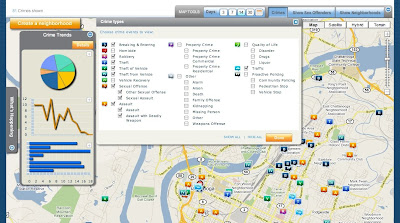
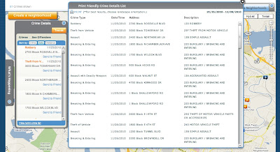
Exploring your map is fairly intuitive, you click on an incident icon and get a pop up that gives you the date, block location, police report number(?), time, UCR classification, and reporting agency. You can also email the incident to a friend from the pop up. One of the best features is the Crime Details toolbar on the left side of the screen. From there you can get a list of incidents by crime, date, and distance. Click on the Trends button and you get can get your graph on. Click on a graph to enlarge it. Click back on the Details button and look at the bottom of the window, you can print a list of all incidents in your filter. Very nice. Unfortunately, it isn't easy to copy and paste that info out because it is a Flash pop up. I even printed it to pdf and couldn't extract it because it is an image, oh well.


There is also a neighborhood feature pending, click on Create a Neighborhood to see the status message. This could be an interesting feature, but I can see how it would be impossible to control.

Nice tool, easy to use, and now that you know how it works, you should get the free CrimeReports iPhone app! It is a very nice app that can, of course, use your current location and show incidents reported near your location. If you create an account with the site, you can even setup alerts for reports. Of course, these alerts will only fire when the file containing the incident is uploaded, so the alert could be 3 days old when you get it, but it is still a very nice feature.

So now you have looked at all the incidents reported around you and seen trends over 6 months... now what?
If you are interested in the trends for these crimes in an area, you can always hit up the SOCRR Public safety report from the Ochs Center. For incident counts and trends over 5 years, choose a neighborhood and play with the Tableau Public interface, I also posted one a while back.

If you are interested in gaining insight into a particular incident or series of incidents, then you need some more tools to use along with the map. I will outline some of these in upcoming posts. A hint to what is next... you noticed that the data CrimeReports gives you only provides a block location and not an address of the incident. Well, and I may be making some assumptions here, the Google Maps API isn't going to map with any level of acceptable accuracy a block location. It needs something like an address. If you zoomed in on any incidents, they are sitting on top of a parcel. Oh yeah...

Friday, November 19, 2010

Catch Up

Ok, been a while... and a lot has happened.

On the Ochs Center's SOCCR front, the Health report has been released and the Economic one is soon to follow.

Tableau Software released version 6 with some nice new features.

I have started playing around with Google Refine. It is a Google release of a previous Freebase app used for cleaning up messy data. To give it a try, I have been using it to clean and prep the NUFORC database that I got from InfoChimps. It is a really nice tool. It works very well for things that would take function writing in Excel or cursors in mySql. It certainly doesn't replace those two, but works very well with and between them.

Oh yes, UFO data. This is the most distracting data I have ever worked with because I want to read every entry. There are over 60,000 entries in the set, I extracted the 870+ ones for Tennessee and further broke it down to the Chattanooga area. I hope to have time to work on extracting the ones for the US, but it is a little messy....that's where Refine is helping. Here is a preview of some info. This graphs the reported shapes, or lack thereof, of the craft. (Note: this is TN only).

Friday, September 3, 2010

2010 SOCRR Public Safety

In case you missed it, the Ochs Center for Metropolitan Studies released the public safety part of its 2010 State of the Chattanooga Region Report (SOCRR) a few weeks ago. You can, and should, download the full report. However, there is a very nice new feature on the site that uses Tableau to display, and allow interaction with, the report data.(North Chattanooga example) Below is a version of it with side by side viewing of crime rate changes by percent and number of incidents. This one works ok to about 3 or 4 comparisons, but with all of the years of incident totals you have to scroll a bit. I did this to demonstrate the fact that you, yes you, can download this data and do something with it. Two things about this - Why this is important and how you can use it.

Is Important - Having these interactive worksheets on the Ochs Center's site is important for many reasons. The ability to interact and do comparisons between neighborhoods is done in an intuitive way that simply wasn't possible before. This tool is great for individuals, organizations, and neighborhood associations who, in the past, had to dig through the full SOCRR or compare individual pdf files for the neighborhoods. Now you just click to build the info you want to see, maybe do some tweaks and then you can save an image or pdf of the chart to use in a presentation. Better yet, you can view the data and download it. If you really need to spend some time with it, download the whole workbook and explore it, full screen, on your computer with the free Tableau Reader. (When using the site, pay attention to the icons on the bottom of the viz, they are what allow you do these things.) This tool, together with the full SOCRR, is a strong combination. The tool allows for quick reference and numbers, but without understanding the data sources and report methodology outlined in the full report, it is just looking at the surface.

Use It -
Apart from doing quick comparisons here or at the source, there are more fun and powerful things you can do with it. As mentioned, you can download the whole workbook from the download link in the lower corner of the viz. This workbook can be opened in any Tableau product and explored or, in Desktop and Public, manipulated and transformed. For example, if you just want to explore the charts full screen, you can use Tableau Reader. It gives you basic functionality but doesn't allow any changes to the data or workbook. If you wanted to dig deeper and alter it to your needs, you could use Tableau Desktop or Tableau Public(free). (Note - anything saved in the Public version is published to Tableau's servers and is available to be downloaded by anyone. Thats how you got it!) With the one below, I took the workbook, cut it down to a few sheets and created a dashboard and placed them side by side. Another one I am working on triggers the charts from the shooting map I built. So you click on an incident and it displays crime stats for that neighborhood. Likewise, I will try to set a filter on the neighborhood list so choosing a neighborhood will highlight the incidents on the map. You get the idea. Keep an eye out as the rest of the SOCRR is rolled out.


(Another note: Not that it would change things here, but I am now on the board at the Ochs Center. I don't have any connection to Tableau, I just love and use their products.)

Followers